
How to Style a Drawing Room with Vintage Finds
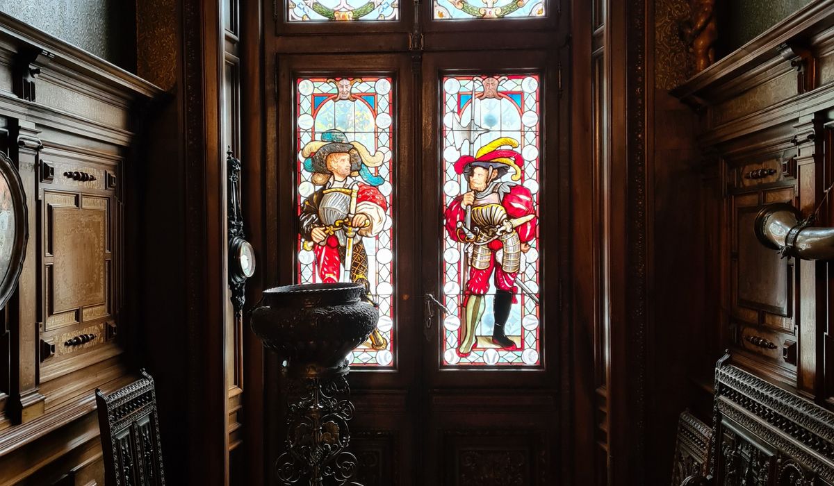
A drawing room is not a living room with a posher name. It is a room with a job: to receive people, to hold conversation, to look as though it has been quietly accumulating character since about 1790. The fastest way to get there is not a shopping list but a set of principles — and the best of them come from the way country houses were actually furnished, which is slowly, unevenly and with a great deal of inherited clutter.
Begin with the Room, Not the Furniture
Before anything is carried in, look at what the room already tells you. Its proportions will dictate where the main seating group sits: in a Georgian or Victorian drawing room, that is almost always a pair of sofas or a sofa and two wing chairs angled towards the fireplace, not pushed flat against the walls. Pull everything forward by 15–20cm so it floats. Country house rooms feel generous because furniture sits in the space rather than lining its edges.
Take note of the light, too. A north-facing drawing room will always read slightly cold, so lean into faded blues, greys and sage rather than trying to fight it with gold. A south-facing room can take deeper reds, ochres and tobacco browns without turning overheated. Work with the architecture and you will spend far less money making the room feel wrong.
The one modern concession worth making is a hardwearing wool carpet or a plain sisal fitted wall to wall. Everything vintage goes on top of it, which gives you a neutral stage for the layered look that follows.
Start with the Rug, Then Break the Rules
A faded Persian or Turkish rug is the single most useful thing you can put in a drawing room. Its colours have already settled into something muted and forgiving, and its pattern softens the room in a way no plain floor covering manages.
Buy the largest you can afford — ideally large enough that the front feet of every piece of seating sit on it. If you want the collected look, layer a second, smaller rug over the first at a slight angle. An old kilim or a worn runner across the hearth works well. Keep the two rugs different in scale: a busy floral under a geometric kilim, never two dense patterns fighting each other.
A few things worth knowing:
- Turn rugs every six months so they fade evenly and wear in the same direction.
- Use a thin anti-slip underlay rather than a thick rubber one, which traps damp on old wool.
- A rug that is slightly too small reads as a mistake; one that is slightly too large reads as confidence.
- Sun damage is permanent. Rotate pieces near windows and use a lined curtain on the brightest side.
Hang Portraits the Way They Were Hung
The mismatched portrait wall is the heart of the look, and it fails when people try to make it tidy. Avoid the temptation to buy a set of matched frames. Instead, collect oil portraits, mezzotints and engravings across a century or two, in gilt, dark wood and plain black frames, and hang them close together in a loose cluster.
Aim for centres at roughly 150cm from the floor, then vary it by 10cm either way. Keep gaps between frames to about 5–8cm — tighter than you think. Fill an entire wall between two windows, or hang three or four over a sofa, stacked two deep. Mix a large portrait with small landscapes and one or two silhouettes. Nothing should line up perfectly along the top or bottom edge; the eye should travel.
In country houses, pictures were often hung from a picture rail on brass hooks and chains. If your room has a rail, use it. It lets you rearrange at will, and it saves the plaster.
Age Your Lighting with Brass
Nothing dates a drawing room faster than a row of matching lampshades in a cool white light. Brass, on the other hand, improves with handling. Look for table lamps with a weighty brass base — a converted oil lamp, an old reading lamp, a banker's lamp with a green glass shade — and pair them with warm bulbs of around 2700K, no brighter than 60W equivalent.
Place lamps in odd numbers and at different heights: one on a side table, one on a console behind the sofa, one on a bookcase. Light the corners, not the ceiling. If you have a central pendant, fit a pleated silk shade in cream or a deep colour and keep it dimmed for evenings.
Resist over-polishing. Brass that is cleaned hard every week looks cheap and new. Let it dull, work up a soft patina, and only brighten the highlights with a dry cloth.
Layer Texture, and Let Some Things Look Used
The difference between collected and decorated is largely texture. Build it in layers:
- Upholstery: a linen or wool sofa in a neutral, then a pair of chairs in a faded stripe or a worn velvet.
- Soft furnishings: a wool throw over one arm, a faded tapestry cushion or two, a linen bolster that never quite matches.
- Surfaces: a scrubbed oak side table, a marble-topped console, a bamboo or rattan occasional chair. Contrast is what stops the room feeling like a showroom.
- Accessories: a stack of old leather books, a tarnished silver tray, a china bowl, a single large jug of garden foliage.
Leave one thing imperfect: a chair with a worn arm, a rug with a mended corner, a lampshade with a small water stain. That small flaw is what convinces the eye the room has a history.
Sourcing Slowly, and Buying Well
The collected look cannot be assembled in a weekend, and it should not be. Country house auctions, local salerooms, charity shops in market towns and the backs of antique centres are where the good things turn up. Go with measurements written down, a tape measure in your bag and a budget you are willing to break once a year for something genuinely lovely.
Check the practicalities before you fall in love: a rug for dry rot and moth, a chair for a sound frame and springs, brass for cracks at the joints, frames for woodworm and for whether the portrait is oil or a later print. Ask about provenance — a name on the back is always worth having.
Above all, buy things you actually like looking at. A drawing room furnished with pieces you have chosen one at a time will always beat one ordered from a single page. That, in the end, is the whole trick.

4 Comments